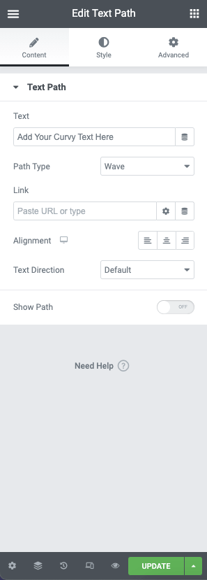
With the Text Path Widget, you can put text on any shape. You can choose from a list of predefined shapes or upload your own SVG shape, which you can then customize and style as you like.
Widget Controls #
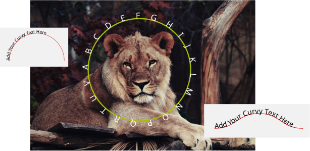
The text path widget features the following controls:
- Text – Enter the text you wish to be displayed or use the dynamic options
- Path Type – From the dropdown list, choose the path type. You may select from the following options:
– Wave
– Arc
– Circle
– Line
– Oval
– Spiral
– Custom (Upload your own SVG path file) - SVG (When Custom is selected) – You may upload a custom path to the media library using .SVG format and apply this to the text path
- Link – Add your link URL or chose from the dynamic options
- Alignment – Chose the alignment for your text
- Text Direction – Choose the orientation of your text Default, RTL, or LTR
- Show Path – Toggle this option to show your path
Style Options #
Text Path #
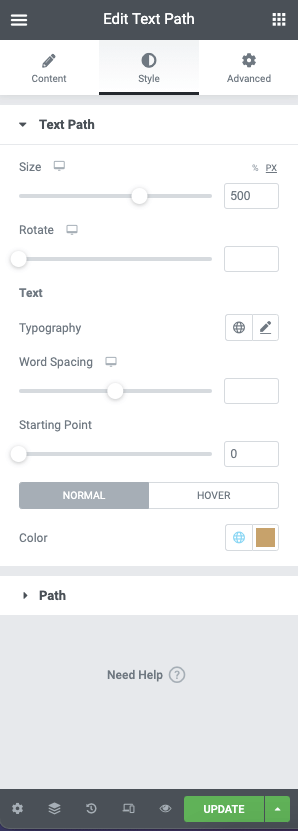
The text path has the following style controls. These control the container of your path:
- Size – Set the size of the text path container using % or PX
- Rotate – Set the rotation your container in degrees
Text Options #
- Typography – Set the font family, sizes, and style, or use the global typography control
- Word Spacing – Use the slider to set the word spacing in %
- Starting Point – Use the slider to set the start point of your text on the path
- Color – Choose the color for your text using the color picker or dynamic functions. Colors may be set for Normal and Hover classes.
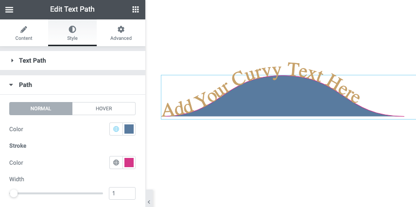
Path #
Control the appearance of the path using the following options. These options can be set for Normal and Hover classes:
- Color – Choose the background color of your path using the color picker or global options
Stroke #
- Color – Choose the background color of your stroke using the color picker or global options
- Width – Use the slider to set the stroke width in PX