Product Carousel widget helps you to show a set of products with titles, description and the price, that will exhibit one after the other in a sliding motion.
And what’s more?? If you even have thousands of products, you don’t need to worry about loading that huge amount of product. We have an autocomplete select for that. Just type a letter of the product name and autocomplete will give you suggestions. Check it out…..
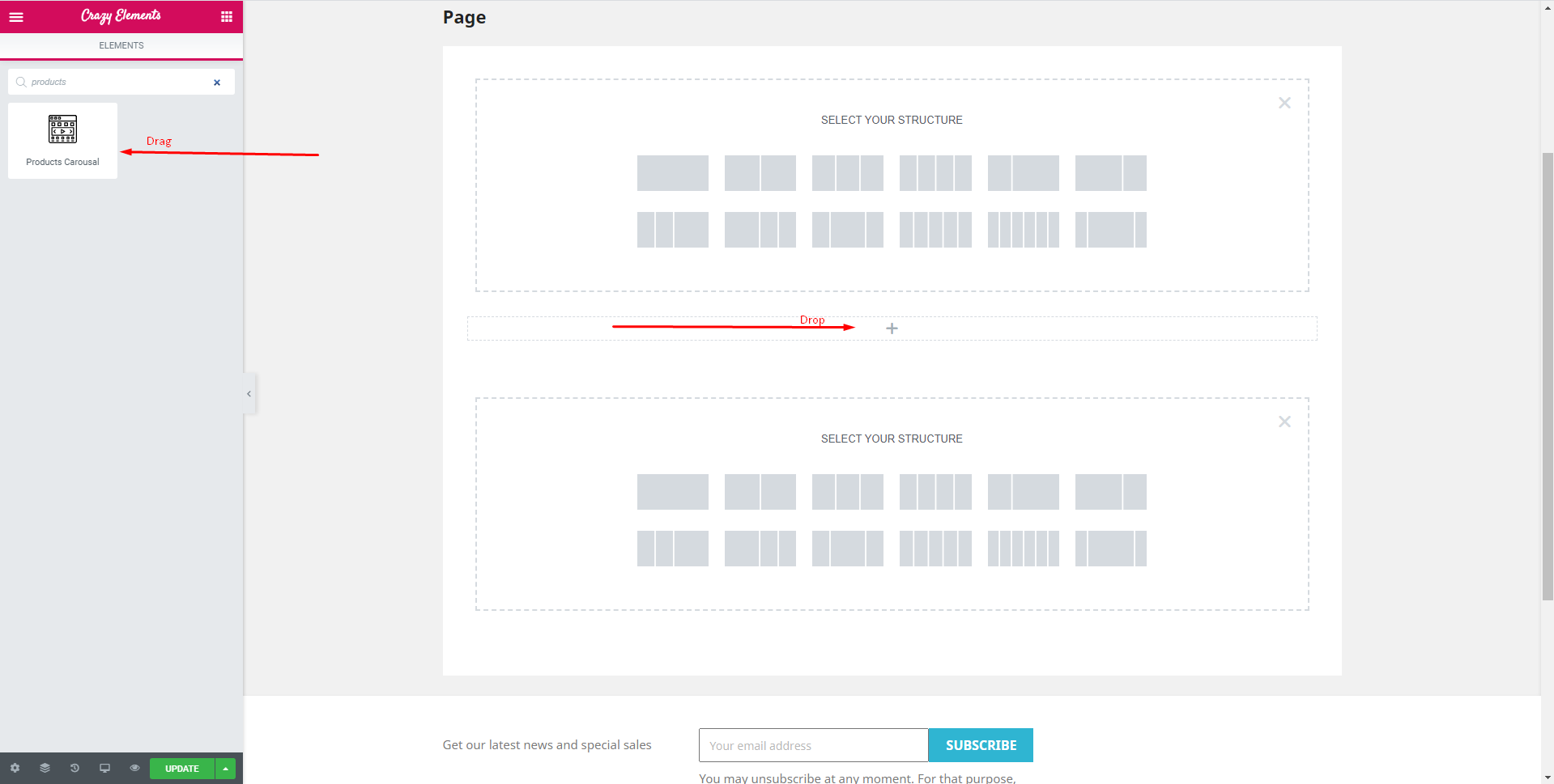
Step 1:
Select the products Carousel widget from the crazy elements(page builder) from the left side of the menu bar from your screen then drag and drop it in the selected area.
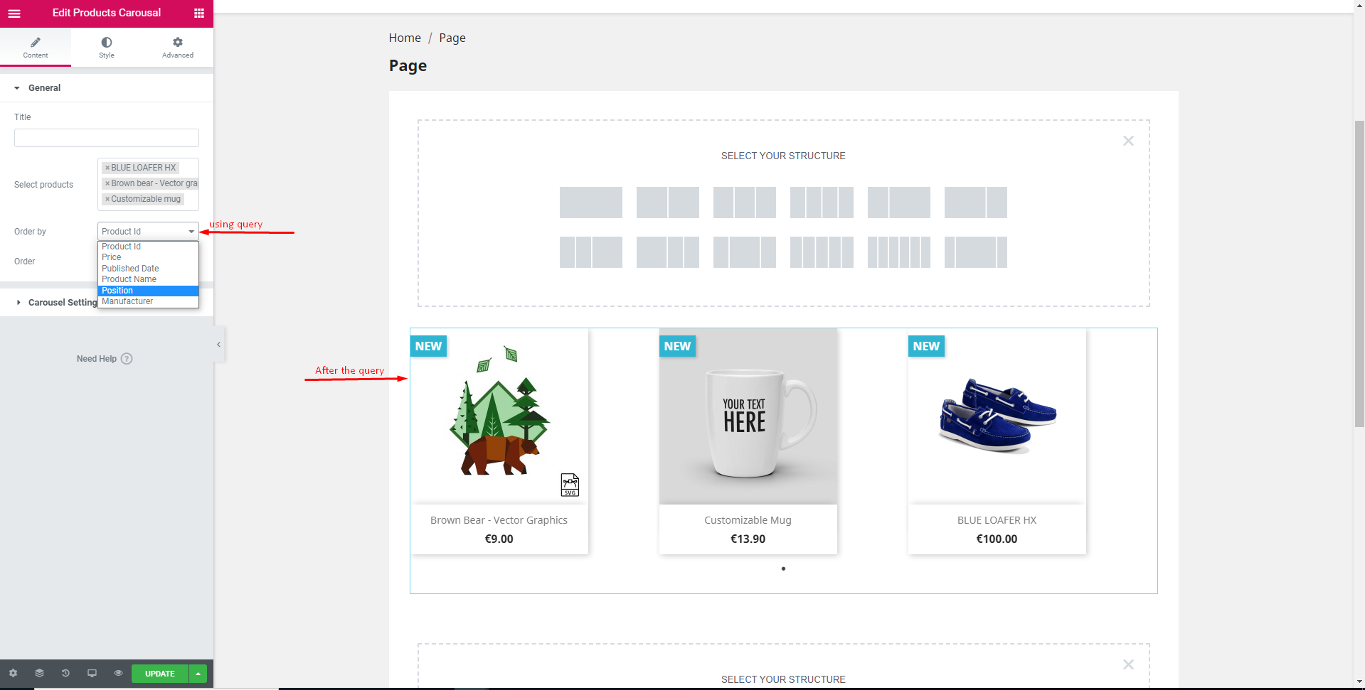
Step 2:
After dropping the selected area it will automatically take you to the content tab. Here you can search the product by product name.
After that you can scheme the product by using the query order by (product id, price,product name, product date) and also serialize the product by using order(ascending and descending).
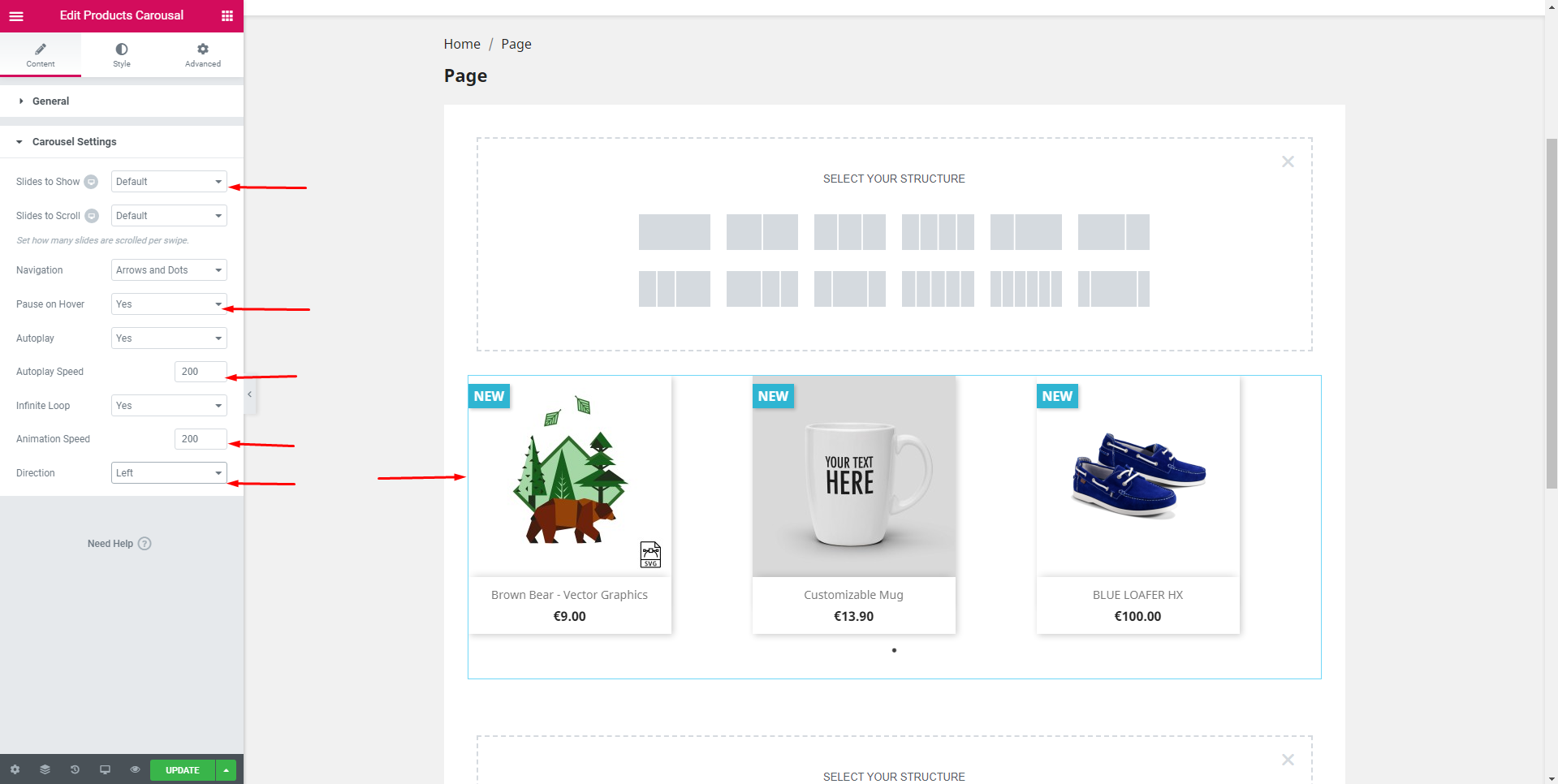
In the carousel settings you can give how much you want give in one slide and how much you want to scroll in one slide which way you want to pause the scroll and which direction you want to scroll, want autoplay or not, want infinity loop or not and also can give animation and autoplay speed.
Step 3:
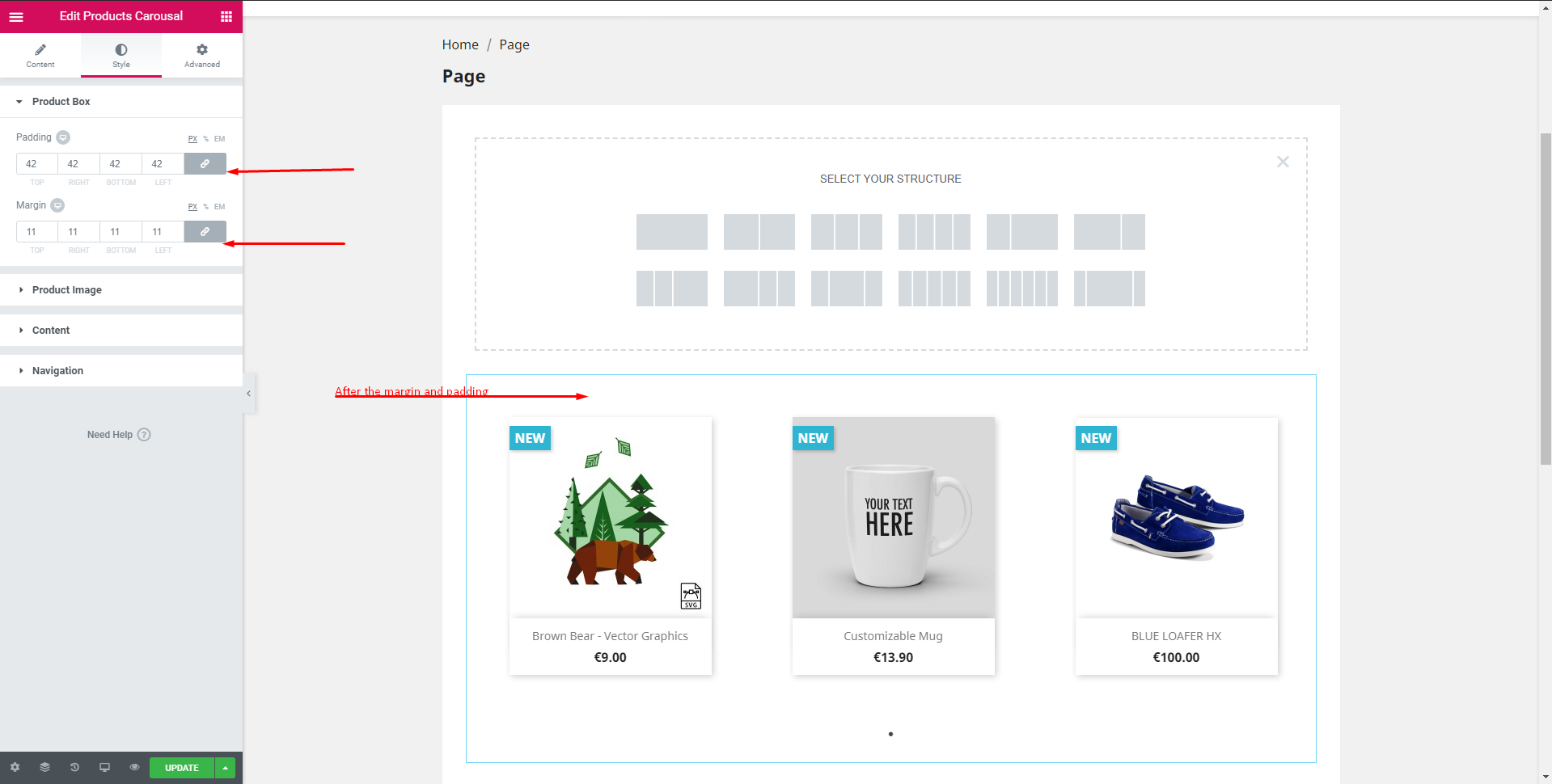
In the style tab you get the options to design your product box where you can give the padding and the margin of the product.
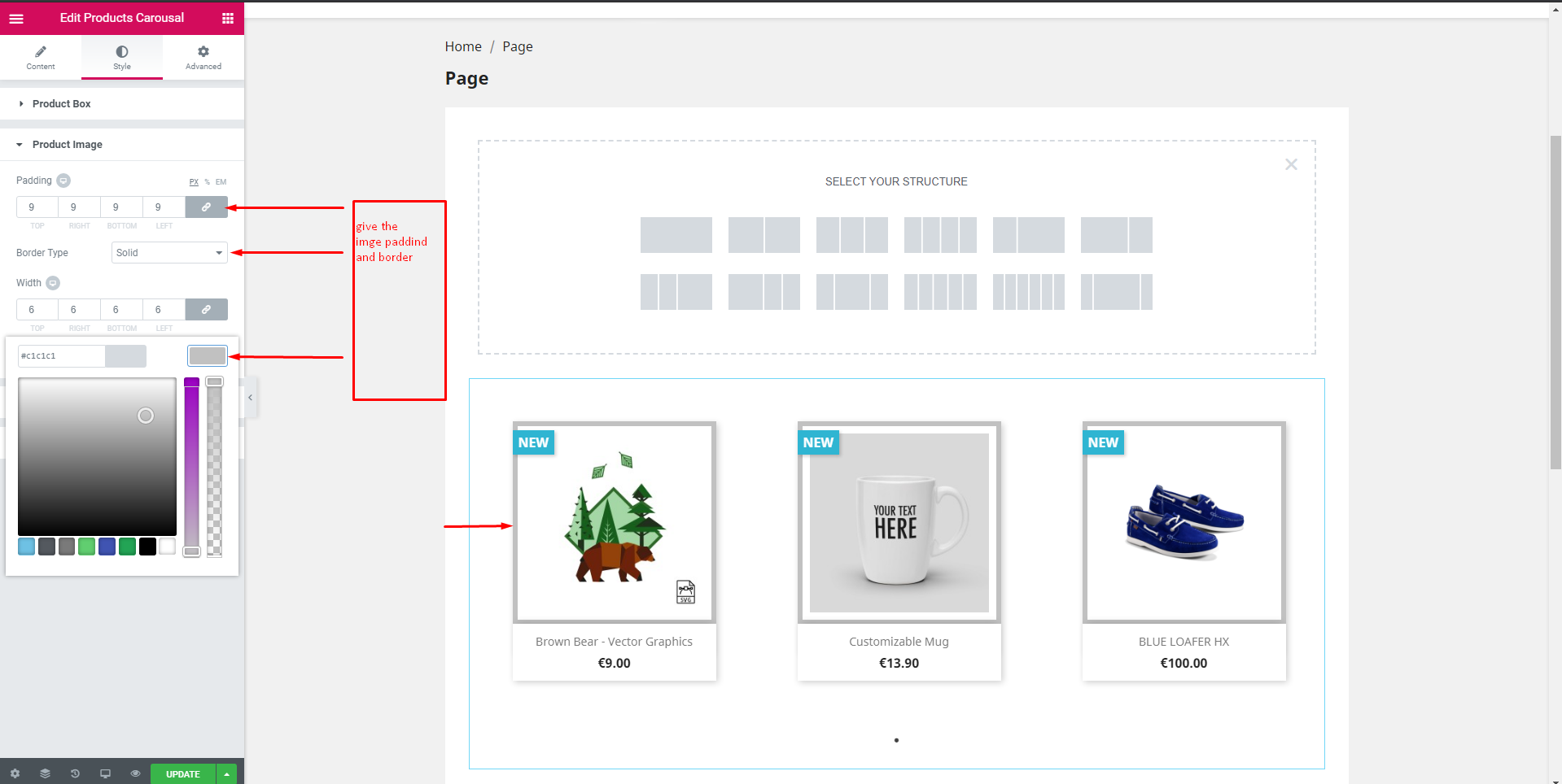
In the product Image tab you can give only the image padding, width, border and the color of the product.
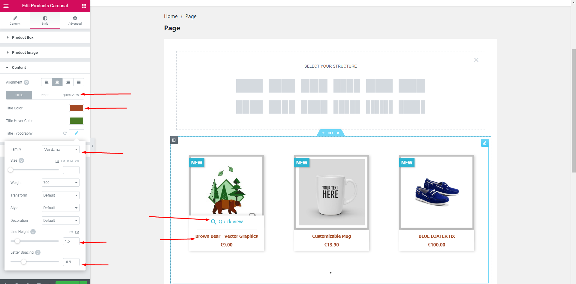
After completing the above task in the content tab you can change the title color, title hover color, title typography, alignment and also the price and the quickview color, hover color, typography and the alignment.
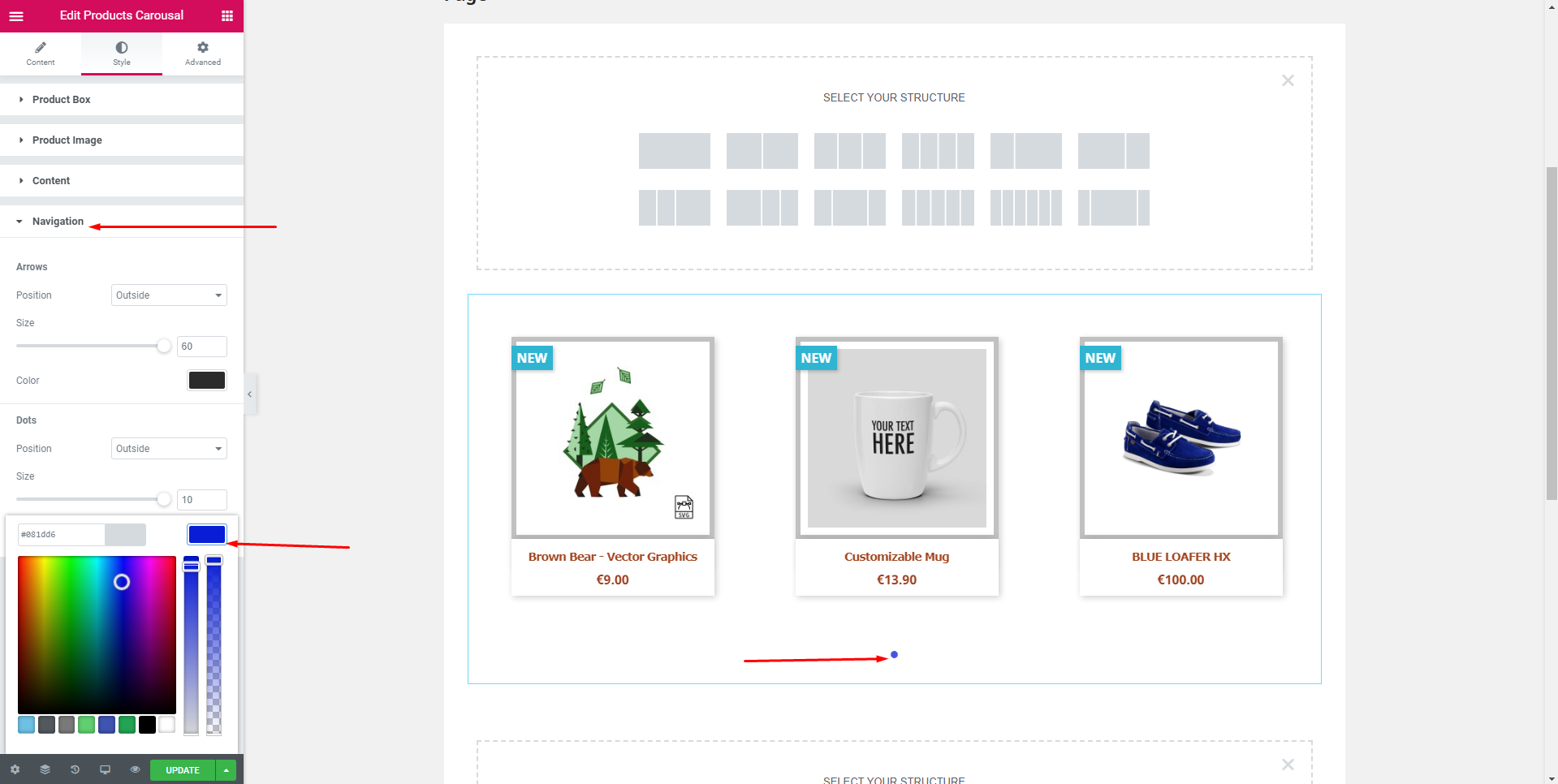
In the navigation tab you can give the navigation size, color, and the product or the outside).
Step 4:
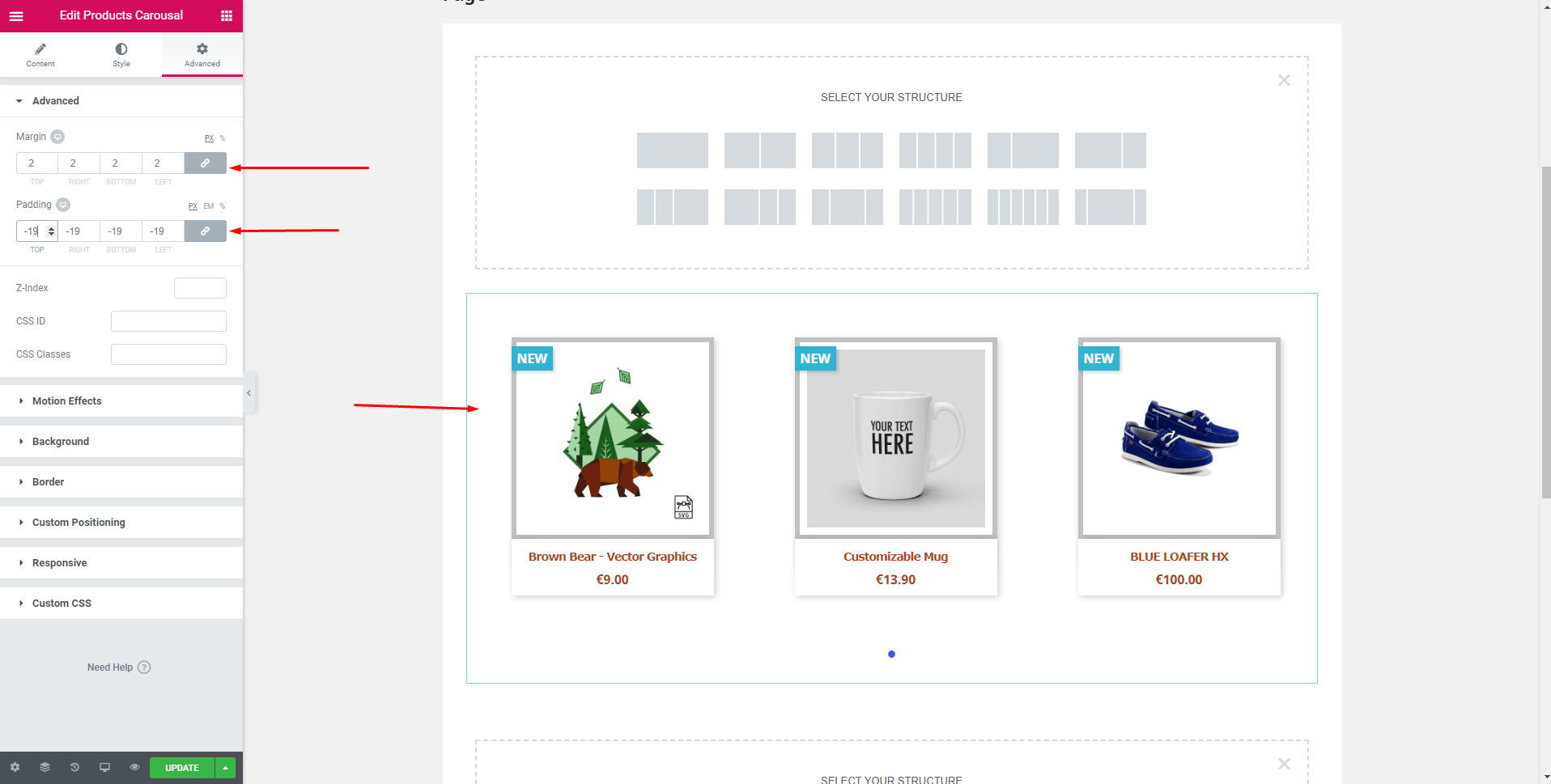
In the Advanced tab you can add the margin, padding, Z-Index, CSS (Id, Class) motion effects, Background, Border, Responsive and others.
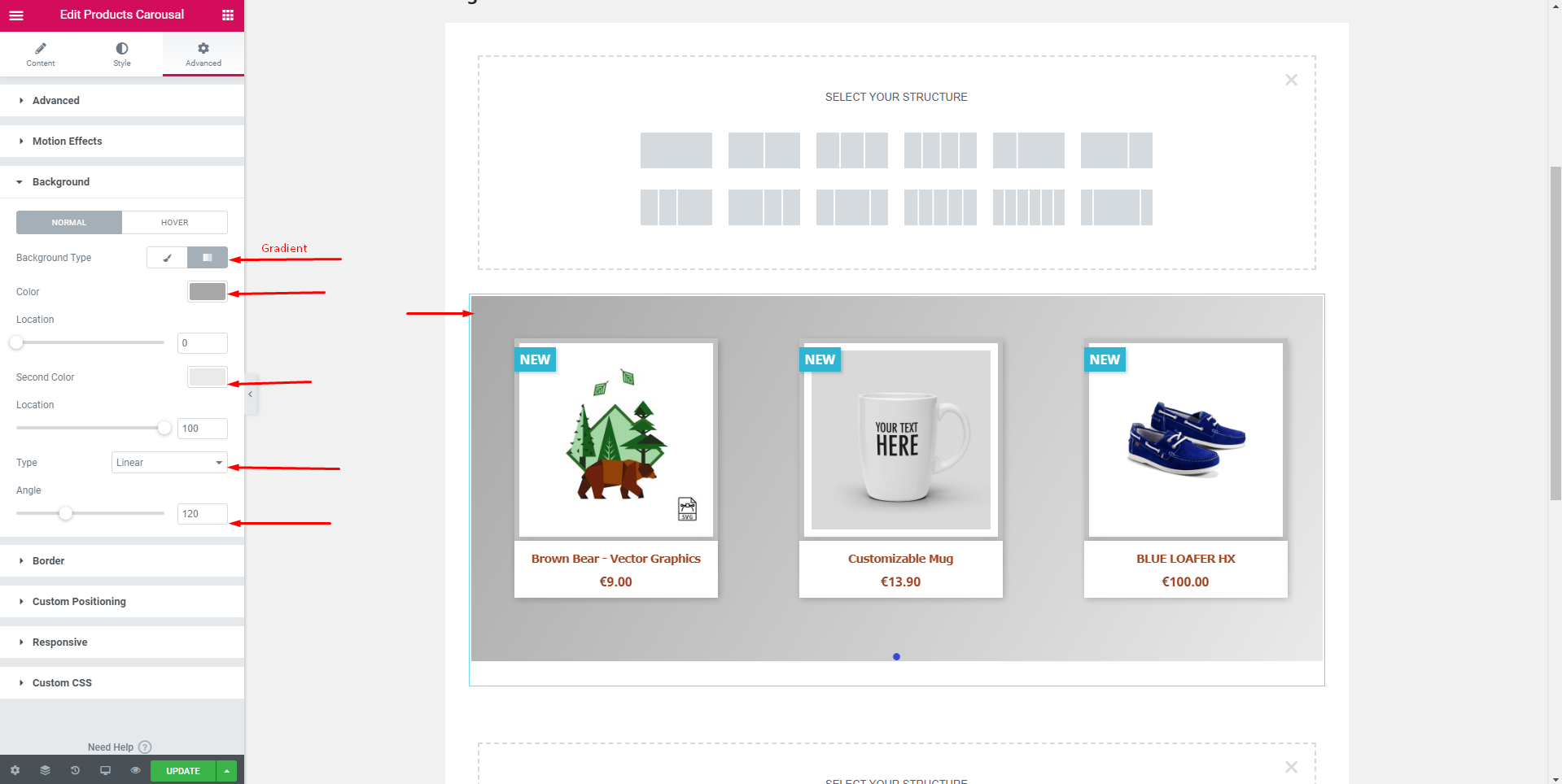
After left clicking on the background you will get two tabs Normal and Hoover. Here you can edit your countdown in two ways: classic or gradient. In both ways you can add background image, color, position, attachment, type(linear, radial) angle and location.
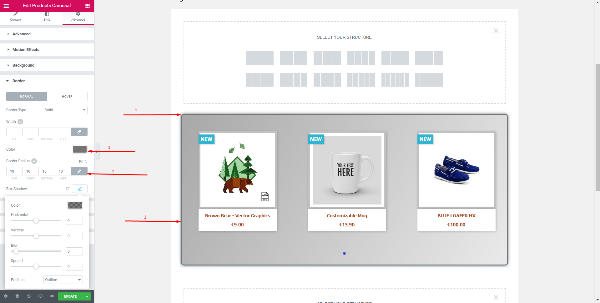
In the Border tab you can edit the border of your countdown in two modes(Normal, Hover). In both modes you will get the different types of border options(Solid, Double, Dotted, Dashed, Groove) and you can give the border radius, box shadow(horizontal, vertical, blur, spread and the position(inline and outline)). You can also add custom positioning, responsive and custom css.
To get new videos, Please Don’t Forget to Subscribe Our Youtube Channel!


